UX/UI Design in Gaming
A case study of Animal Crossing: New Horizons and how to apply UX/UI best design practices in a gaming context. This project was attached to a course hosted by ELVTR and taught by Gaming Industry UX/UI Leader Ivy Sang.
-
Responsibilities:
- Usability testing & UX design
- UI and graphic design
- Wireframing
- Prototyping
- Accessibility testing -
Challenges:
- Limited graphic design experience.
- Balancing a full-time job and classwork.
- No experience with functional prototyping in Figma. -
Tools & Software:
- Figma
- Adobe Photoshop -
Duration:
- 7 Weeks
Design Process
>
>
>
>
>
>
>
Design Process
Player profiles help designers understand the target audience, reduce scope, and keep focus
Player Profile
-
What would motivate players to play or continue playing?
-
Consider the player's context. What is their knowledge level? What are their life experiences and physical surroundings?
-
What are the player’s biases and expectations toward their game experiences?
Player Journey
using empathy AS A TOOL to bridge COMMUNICATION BETWEEN game developers & Players
Paper Prototype
A low-fidelity visual representation of player choices during in-game navigation
Flow Chart
Designing Game Structure and options
WireFrames
Designing how to visualize, display and communicate GAME STRUCTURE, OPTIONS & information in a clear way
USABILITY TESTS & ITERATIONS
Understanding what design elements help Players with perceptions, attention, & memory
-
How memorable are the basic controls of the game for players?
How clear are objectives for players?
How do players understand and navigate the inventory screen?
How do players feel about the overall design of the wireframed screens?
-
3-5 participants.
Interactive wireframed prototypes.
In-person moderated interviews.
-
Controller/input memory (couldn’t remember buttons.)
Objective memory (couldn’t remember what to do.)
Unclear Characters (couldn’t identify specific characters.)
-
Persistent controller buttons HUD.
Dialogue box progression arrows.
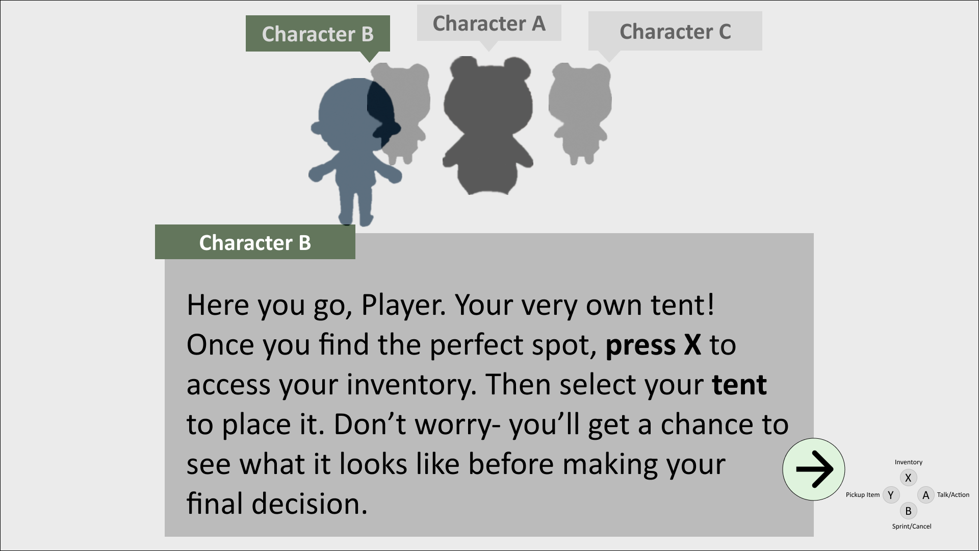
Character name bubbles to indicate who is speaking.
Matching the color of the speaking characters’ bubble to the dialogue box title.
Persistent HUD for the objective list (“To Do:”)
UI Style Guide & Mock-ups
Communicating with players is about gathering their attention and navigating them as intended
-
Hand-drawn assets to match the style of Animal Crossing.
Dynamic elements indicate what is happening or who is speaking.
Graphical effects like blur, drop shadow, or strokes help on-screen elements stand out.
Colors and fonts match closely with Animal Crossing branding.
-
The name indicator over bubbles matches dialogue boxes.
The persistent HUD button is in the lower right of the screen.
The “To Do” game objective reminder is on the right of the screen.
AccessIBILITY TESTing
Testing UI Mock-ups for color VISION DEFICIENCY
Monochrome vision deficiency test example.
Iterated mock-up: modified font sizes, color contrasts, and blurring effects.
REFLECTIONS & Final Thoughts
Taking this class was an enriching experience; I enjoyed working collaboratively with my peers to share resources and create a micro-community of support.
I now better understand UX design in the context of the gaming industry.
Looking Back
Player profiles and journeys are essential for highlighting a game’s target audience and establishing communication between developers and players.
Empathy is a powerful tool for determining players' actions and feelings.
Usability testing allows UX designers to better understand players' perceptions, attention, and memory to identify potential problem areas.
Always consider accessibility at every step of the design process.


